

Paul Dufour: Guest Blogger
Boeing Technical Fellow, (retired)
Engineering Specialty: Aerospace Structures
When I graduated from engineering school nearly 40 years ago, I had the distinct idea that working for an engineering company meant making calculations and crunching numbers all day. Little did I know how much time over my career would be spent talking with people, writing, and trying to clearly communicate complex technical ideas. Since people are visual creatures, good graphics are essential for this. I did have a rudimentary drafting class in college, but that was the extent of it related to technical graphics. Even that made an impression on me that has stuck – I make my arrows a certain way because the professor got upset if our annotation and dimensioning arrows didn’t look nice and slender, and this idea has stuck with me in my usage of canvasxdraw to this day!
Visual display of ideas has been extremely important in science and engineering since the very beginning. An example I like to use is “Discourses and Mathematical Demonstrations Relating to Two New Sciences” by Galileo Galilei from 1638. There are several things I find fascinating about this old book. Although it’s more widely known for his discussion of bodies in motion, it’s really the first technical document that describes my field of interest, which is the strength of materials, as the other of his “two new sciences”. The book is not the easiest to read as it’s written in an old form commonly used in those days, which is a discussion and debate amongst three imaginary guys, Simplicio, Sagredo, and Salviati. Simplicio’s role is sort of as the dumb guy of this little triumvirate who asks a lot of questions – I relate to him well. But what really strikes me about this document is Galileo’s technical illustrations. Of course they are old fashioned, but they are awesome and clearly explain his ideas. I would argue that the time you spend creating effective engineering graphics helps you understand your problems and their solutions just as much as it helps to explain them to others. If you can’t explain it clearly, maybe you don’t fully understand it yourself. I’m not going to argue that you should use canvasxdraw to create little branches and bushes on your cantilever beam supports! However, I do imagine that while Galileo was doodling this stuff, he was slowing himself down enough to think very deeply about the problems he was trying to solve and explain.
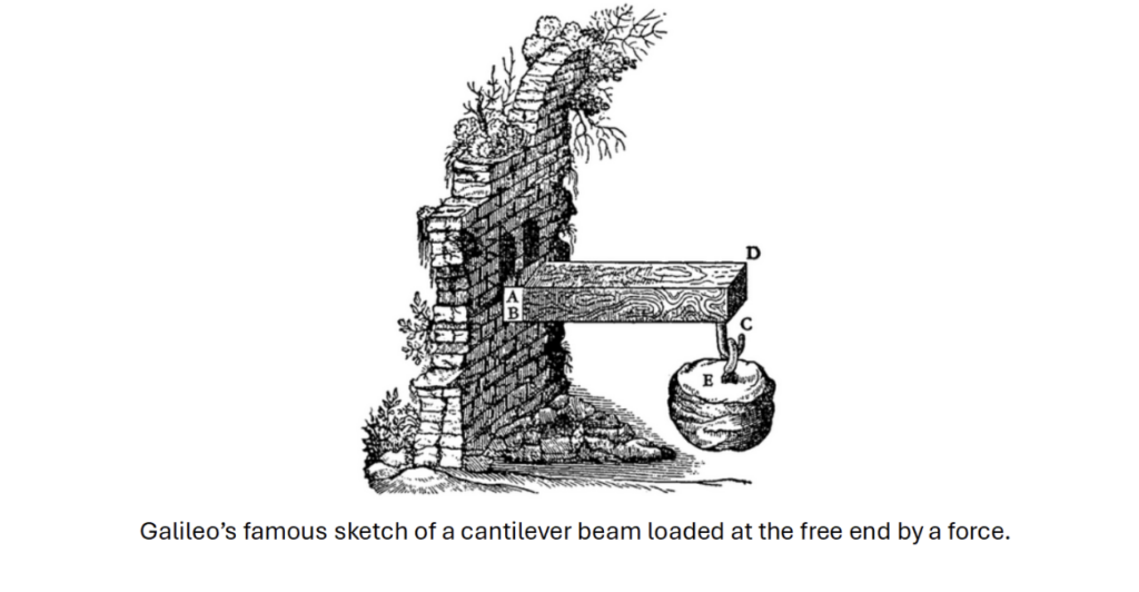
Galileo’s famous sketch of a cantilever beam loaded at the free end by a force.
When I first started working, our reports were mostly done with graphics drawn by hand with pencil and paper. Some of the experienced engineers were quite artistic and their technical sketches were incredible, something that made a deep and lasting imprint on me. Those technical illustrations helped me to learn, and since that time I’ve come to see engineering as an intersection point where practical science and art meet. There is an old saying in aerospace engineering, “If it doesn’t look right, it won’t fly right.” I take the same approach to technical documentation. If it looks bad, with poor graphics (or none), and is hard to understand, do you totally trust that the person took the required care into the thinking that went behind it? Technical sketching and illustration supplements CAD data but serves a different fundamental purpose, which is to show and explain as a part of documentation and presentations.
Many engineers today use Microsoft PowerPoint to create technical graphics. This is the wrong tool for the job and very inefficient for producing technical illustration/graphics. And if I can be totally honest here, they usually look bad! I see this as the fault of the tool, not the engineer using it. Over the years I looked at and tried several other software solutions to this problem, but my search ended with Canvas X and canvasxdraw. This software became an extremely strong tool in my arsenal, and I developed a reputation for being able to quickly create high quality and professional looking technical graphics to help explain my ideas. With canvasxdraw I could create graphics that looked like they came out of a textbook, and it was a tool I used almost daily in my work as a structures engineer for the last 20+ years. In these blog posts, I’m going to talk to you about and show you how to use canvasxdraw for basic technical illustrations in engineering documentation. I’ll also talk more generally about the importance of good graphics for clear technical communication, which ultimately became far more important to my career than just crunching numbers!